 how-to
Maintaining Color Consistency Across Print Batches
Table of Contents
- Why Color Drifts Between Print Runs
- Building a Color Management System for Printing
- Calibrating Equipment Before Every Job
- Using ICC Profiles for Accurate Color Reproduction
- Measuring Color with a Spectrophotometer
- Managing Substrate Variations and Finishing Effects
- Maintaining Color Consistency Across Print Batches: A Checklist
- Partnering for Consistent Brand Color
- Frequently Asked Questions
Last Updated: September 5, 2026
Why Color Drifts Between Print Runs
Color consistency is the measurable degree to which printed colors match the approved proof and stay uniform across multiple production runs. If you have ever unboxed a fresh batch of branded collateral only to find the logo looks slightly orange when it should be red, you already know the cost of drift. That gap usually comes down to five variables: ink density, dot gain, substrate absorption, press conditions, and environmental factors like temperature and humidity.
These variables shift between jobs, not just between presses. A 2% change in dot gain can push a brand color outside its acceptable delta E tolerance (PubMed). At American Printing Services, LLC, we treat drift as a process problem rather than a random failure. Below, we show you how to lock down each variable so your next print run matches your last one.
Building a Color Management System for Printing
A color management system for printing is the structured set of profiles, calibrated devices, and measurement routines that keep color predictable from design file to finished sheet. It is not a single piece of software but a discipline that connects your monitor, your proof, and your press so all three agree on what a color should look like.
The core of that system is a standardized workflow. Every file that enters production should pass through the same color space conversion, typically RGB to CMYK, using the same rendering intent. When everyone on the team follows one workflow, you remove the guesswork that causes one operator to compensate differently than another.
Standardizing Your Workflow
Start by documenting the exact path every job takes. Your workflow should specify the CMYK color space, the ICC profile for your press and paper combination, and the target ink density readings. This documentation becomes your reference point when a job goes off color, because you can isolate which step introduced the variation.
Calibrating Equipment Before Every Job
Calibration brings your monitor, proofing device, and press back to a known, neutral baseline before you measure anything else. It is not a single event but a tiered process with different frequencies and tolerances for each device. Most shops calibrate monitors weekly and proofers before each job, but the press needs daily attention, as ink density, registration, and dot gain drift as the press warms up and ink temperature changes.
Monitor Calibration
For your monitor, the practical target is a white point of D65 (6500K) with a gamma of 2.2 and a luminance of 80-120 cd/m², depending on your viewing booth. Use a hardware calibrator, a spectrophotometer or colorimeter that sits on the screen, rather than adjusting by eye. Software-only calibration is not sufficient because it cannot correct for the physical drift of the display's backlight. Recalibrate weekly, and re-verify immediately if you notice the display warming up or changing color after a long session.
Proofer Calibration
Your proofing device should be linearized before each job. This means running a target through the proofer, measuring the output, and building a correction curve so that the proofer's output matches the expected values. A typical target is the ECI2002 or IT8.7/4 chart, which contains thousands of patches. After linearization, verify with a small set of critical brand colors. If any patch exceeds a delta E of 2.0 from the reference, re-linearize before proofing the job.
Press Calibration
The press is where most color drift begins, not with the file, but with an uncalibrated press that silently shifts its output over a few hours. A common mistake is calibrating once and assuming the press stays true for the entire shift. Run a quick calibration check at the start of each job and again after any significant downtime, including lunch breaks, shift changes, or a paper roll change.
A practical press calibration check includes the following measurements on a pulled sheet:
- Solid ink density (SID): Measure the density of each process color (CMYK) in the color bar. Typical targets for coated stock are 1.40-1.50 for cyan, 1.40-1.50 for magenta, 1.00-1.10 for yellow, and 1.60-1.80 for black. These numbers vary by ink brand and press model, so your target should come from your own fingerprinting run.
- Dot gain (tone value increase): Measure the 50% patch in each color. A typical target is 18-22% dot gain on coated stock for a conventional offset press. If your measured gain drifts more than 2% from target, adjust ink-water balance or impression pressure.
- Print contrast: This is the difference between the solid and the 75% patch, divided by the solid. A print contrast below 30% for cyan or magenta suggests the ink is not laying down cleanly and may need a viscosity or water balance adjustment.
Environmental Factors in Calibration
Temperature and humidity in the pressroom directly affect ink viscosity and water balance. Most ink manufacturers specify an operating range of 70-75°F (21-24°C) and 45-55% relative humidity (nist.gov). If your pressroom drifts outside this range, your calibration targets will shift, a 5°F change can alter ink tack enough to change dot gain by 1-2%. Install a hygrometer and thermometer near the press, and log readings at each calibration check. If drift correlates with weather changes, consider pressroom climate control, it is often cheaper than the waste from rejected batches.
Using ICC Profiles for Accurate Color Reproduction
ICC profiles are the translation files that tell your color management system how to convert color space values for a specific device and substrate. A profile for coated stock will not produce the same result on uncoated paper, because the two surfaces absorb ink differently. Managing substrate variations is one of the most overlooked factors in print production, and it is why you cannot rely on a single profile for every job.
You need a dedicated ICC profile for each paper type you run. When your vendor supplies a profile, verify it against your own spectrophotometer readings rather than trusting it blindly. Profiles are a starting point, not a guarantee, and the conditions on your floor will always differ slightly from the lab where the profile was created.
Measuring Color with a Spectrophotometer
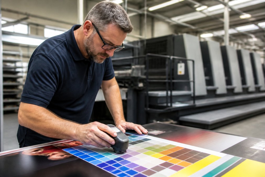
Spectrophotometer use in print is the measurement of reflected light from a printed sample to quantify its color in a numerical space, usually CIELAB. This device replaces subjective visual assessment with hard numbers, giving you a delta E value that tells you exactly how far your printed sample sits from your target. A delta E under 1 is generally invisible to the human eye, while anything above 3 is likely to be noticed.
Choosing the Right Measurement Geometry
Not all spectrophotometers measure the same way. The two common geometries are 45°/0° (45-degree illumination, 0-degree viewing) and d/8° (diffuse illumination, 8-degree viewing with an integrating sphere). For print production, 45°/0° instruments are the standard because they correlate best with how the human eye views a printed sheet. d/8° instruments are more common in paint and plastics industries. If comparing measurements between two facilities, confirm both use the same geometry, otherwise your delta E values are not directly comparable.
Understanding Delta E Calculation Methods
The delta E value depends on which formula the device uses. The older CIE76 formula (delta E ab) is simple but does not account for the nonlinearity of human color perception. The CIE94 and CIEDE2000 formulas are more accurate for industrial tolerance checking. Most modern instruments default to CIEDE2000, the recommended standard for print quality control. When you set a tolerance of delta E 2.0, confirm which formula your software is using, a delta E 2.0 under CIE76 is not the same visual difference as under CIEDE2000.
Measurement Protocol for Press Control
Measure a color bar on every sheet you pull, not just the first one. The color bar contains patches for the solid inks, overprints, and tonal values that tell you whether the press is holding its settings. If you measure only the main image, you are missing the data points that show drift before it becomes visible in the final product.
For a reliable measurement:
- Measure the same patch location each time. Color bars are typically printed in the trim area, and the position of the patch on the sheet matters. Mark the exact patch you measure and use the same one for every pull.
- Take three readings per patch and average them. Paper is not perfectly uniform, and a single reading can be skewed by a dust spec or a slight variation in ink film. Most quality control software will average multiple readings automatically.
- Measure immediately after the sheet is pulled. Ink continues to dry and change color for several minutes after printing. If you measure a wet sheet, the density will read higher than the final dried value. For a quick check, measure wet and compare against your wet-target baseline. For final acceptance, wait at least 15 minutes or use a drying accelerator.
- Use a white backing plate. When measuring uncoated or translucent stocks, the backing material behind the sheet affects the reading. Standardize on a white backing plate (or black, depending on your specification) and use the same backing for every measurement.
Moving Beyond the Color Bar
A color bar tells you about ink density and dot gain, but not the overall appearance of the image. For critical brand colors in the main image area, measure those specific patches directly. Create a target file that includes the brand color patches in the same location on every job, so you can compare the same physical location across batches. This is especially important for spot colors and colors that fall outside the CMYK gamut and require a fifth or sixth printing unit.
Managing Substrate Variations and Finishing Effects
Substrate and finishing choices change how the same ink looks on the final piece. A coated sheet holds ink on the surface, producing a sharper dot and higher contrast. An uncoated sheet absorbs ink, increasing dot gain and softening the overall appearance. Even different batches of the same paper can shift in brightness and shade, so re-verify your profile whenever you open a new skid.
Post-press finishing effects also alter perceived color. A matte lamination scatters light and can make colors appear darker and less saturated, while a gloss coating deepens blacks and makes colors pop. If your job includes lamination or UV coating, proof with that finish applied, because the color you measure on the raw sheet will not match the finished piece.
Maintaining Color Consistency Across Print Batches: A Checklist
The following checklist condenses everything above into a repeatable routine that keeps your color consistency on target across every print run.
| Step | Action | Frequency | Purpose |
|---|---|---|---|
| 1 | Calibrate monitor and proofing device | Weekly | Ensure soft proofs match output |
| 2 | Run press calibration check | Start of each job | Establish neutral baseline |
| 3 | Verify ICC profile for substrate | Each new paper skid | Account for substrate variations |
| 4 | Pull and measure color bar | Every sheet | Track ink density and dot gain |
| 5 | Compare delta E to target | Every measurement | Confirm within color tolerance |
| 6 | Save a physical reference sample | Each job | Match future runs to approved proof |
Human-in-the-loop verification matters here. A spectrophotometer gives you numbers, but an experienced press operator catches subtle issues that a measurement patch misses, such as a mottled solid or a scuff on the sheet. Use the instrument to confirm the data and the operator to confirm the overall appearance.
Partnering for Consistent Brand Color
Managing all of these variables across multiple vendors is the hardest part of brand color control. When each printer uses different equipment, ICC profiles, and quality standards, you are gambling that everyone interprets your brand identity the same way. Supply chain color communication breaks down when specifications live in email threads instead of a shared, controlled system.
A single-source partner removes that risk. American Printing Services, LLC coordinates production across a network of over 2,500 facilities in North America, which means your color standards travel with the job rather than being reinterpreted at each stop. Our team applies the same color management for printing discipline, calibrated equipment, measured samples, and documented tolerances, to every run we produce. If you are tired of explaining to a new vendor why your green is not their green, talk to our team about a color standard for your brand and see how a controlled process delivers the same result every time.
Frequently Asked Questions
What are the most common CMYK color variation causes?
The most common causes are inconsistent ink density, dot gain fluctuations, and improper calibration of the printing press. Environmental factors like temperature and humidity can also affect ink drying and transfer. Finally, using uncalibrated monitors during the design phase can lead to a file that does not match the printed output, creating a perceived color shift between batches.
How do I measure color consistency in commercial print production?
You measure color consistency using a spectrophotometer, which quantifies color as numerical data, often expressed as Delta E values. This allows for objective comparison against a standard. A Delta E of less than 1 is generally imperceptible, while a value between 2 and 4 indicates a noticeable difference. This measurement is more reliable than visual assessment alone.
What is the role of ICC profiles in maintaining color consistency across print batches?
ICC profiles are the core of a color management system for printing. They describe the color gamut of a specific device, such as a monitor or a printer with a certain ink and substrate combination. By using these profiles, you can predictably convert colors from one device to another, ensuring the colors you see on your proof closely match the final print run.
Color drift is not a mystery you have to accept. It is a process problem with a known set of causes and a repeatable set of fixes. By building a color management system, calibrating equipment, and measuring every run, you protect the brand identity you have worked to build. Get started with American Printing Services, LLC and put a color consistency protocol behind your next print order.
This article was written using GrandRanker