 listicle
Best Practices for Trade Show Signage That Drive Traffic
Table of Contents
- Why Trade Show Signage Makes or Breaks Your Booth
- Trade Show Banner Design Tips for Maximum Visual Impact
- Typography and Font Selection for Readability
- Color Palette and Negative Space Strategy
- Effective Trade Show Display Elements: Layout, Lighting, and Placement
- Choosing Materials: Vinyl Banners, Modular Displays, and Print Quality
- Fast Turnaround Commercial Printing Services for Multi-Location Exhibitors
- Accessibility, Sustainability, and Digital Integration in Trade Show Signage
- Post-Event Signage Repurposing and Brand Consistency
- Frequently Asked Questions
Last Updated: September 24, 2026
Why Trade Show Signage Makes or Breaks Your Booth
Trade show signage is the visual system of banners, displays, and printed graphics that identifies your booth and communicates your message from a distance. Get it right and people walk toward you; get it wrong and they walk past. At American Printing Services, LLC, we have over 20 years of industry experience, and the pattern is always the same: booths that draw crowds treat signage as strategy, not decoration.
Trade Show Banner Design Tips for Maximum Visual Impact
The biggest banner design mistake is trying to say everything at once. A banner listing six services, three phone numbers, and a QR code competes with itself. Attendees read one message or none.
Typography and Font Selection for Readability
Readability is a function of distance, not taste. A font that looks elegant on a business card can become unreadable across an aisle. For headlines, choose a bold sans-serif with generous letter spacing and keep body text minimal.
Three rules cover most situations:
- Headlines should be legible from at least 10 feet away
- Body copy should never drop below a size that reads comfortably at arm's length
- Limit yourself to two typefaces per display, one for headlines and one for supporting text
Color Palette and Negative Space Strategy
Color does the heavy lifting in booth aesthetics, and contrast does more for readability than brightness alone. A neon palette with low text-to-background contrast is harder to read than a simple dark-on-light pairing.
Effective Trade Show Display Elements: Layout, Lighting, and Placement
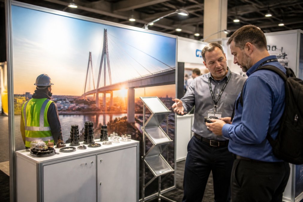
Effective trade show display elements are the physical components, layout, lighting, and placement that turn a printed graphic into a working sales environment. The best banner fails if it hangs where nobody looks.
Eye-Level Signage and Spatial Awareness
Eye-level signage is the workhorse of any display. The average attendee's line of sight sits between chest and head height, so your most important message belongs there, not atop a tall banner where it gets lost in ceiling clutter.
Lighting Techniques for Displays That Draw Attendees
Lighting is the difference between a display that glows and one that disappears. Backlit graphics pull the eye across a crowded hall, especially in dim convention centers with inconsistent ambient light.
A practical setup combines three layers:
- Backlighting behind key banners for depth and visibility
- Spotlights on product displays to create focal points
- Ambient fill light to eliminate harsh shadows on staff and signage
Choosing Materials: Vinyl Banners, Modular Displays, and Print Quality
Material choice comes down to how often you exhibit and how much abuse your display will take. Vinyl banners are the budget-friendly workhorse: durable, weather-resistant, and cheap to reprint when a message changes, suiting one-off events and outdoor setups well.
| Material | Best For | Reusability | Key Trade-off |
|---|---|---|---|
| Vinyl banners | One-off and outdoor events | Low | Cheap, but reprinted each time |
| Modular displays | Multi-show schedules | High | Higher upfront cost |
| Backlit fabric | Premium booths | Medium | Best visual impact, needs frames |
Fast Turnaround Commercial Printing Services for Multi-Location Exhibitors
Fast turnaround commercial printing services matter most when a show date is fixed and your graphics are not ready. Multi-location exhibitors face a harder version: several teams, several booths, one brand standard.
Accessibility, Sustainability, and Digital Integration in Trade Show Signage
Most guides stop at aesthetics. The exhibitors who get the most from their signage treat accessibility, sustainability, and digital integration as design constraints that produce a better booth. Here is how to execute each.
Accessible signage: designing for every attendee
The U.S. Access Board guidelines on accessible design govern reach ranges, clear floor space, and protruding-object limits in public spaces, and those same principles translate directly to booth layout. Practical rules that follow from them:
- Keep the most important printed message between roughly 48 and 60 inches from the floor so it lands in the natural sightline of both seated and standing attendees.
- Maintain a minimum 36-inch-wide clear path through and around your booth so wheelchairs, scooters, and strollers can pass without forcing a detour.
- Avoid mounting signs so they protrude into walkways at head height, where they become a hazard for attendees with low vision.
- Pair every color-coded element with a text or shape cue. Roughly one in twelve men has some form of color vision deficiency, so a red/green status indicator on a demo sign is invisible to a meaningful slice of your audience.
- Set body text at a contrast ratio of at least 4.5:1 against its background, the same threshold used for digital accessibility, and push headline contrast higher.
Sustainable materials: what to specify and what to ask vendors
The U.S. Environmental Protection Agency's guidance on sustainable materials management frames the core idea: reduce, reuse, and recycle in that order of priority. Applied to trade show signage, that means:
- Reuse first. Modular frames, tension-fabric systems, and reconfigurable backwalls are the highest-impact choice because the structure survives dozens of shows while only the printed panel changes.
- Specify recyclable substrates. Corrugated cardboard displays, PET-based banner films, and aluminum frames are more widely accepted in recycling streams than PVC vinyl, which is difficult to process in most municipal programs.
- Ask about inks. Water-based and UV-curable inks avoid the solvent load of traditional screen printing and are increasingly standard at commercial print shops.
- Plan the end of life. Ask your print partner what happens to a banner after the show. Some will take back and reprocess graphics; most will not unless you ask.
Digital integration: pairing screens with print
Static banners still anchor a booth because they never crash, never need power, and read instantly from across the hall. Screens handle everything that changes. The strongest setups split the work:
- Print carries the fixed message, brand name, core offer, booth number, and the one headline you want remembered.
- Screens carry the variable content, rotating product videos, live demos, countdown timers, and dynamic pricing.
- QR codes bridge the two, a printed code on a banner or table sign links to a landing page, a demo video, or a calendar booking, turning a static graphic into a lead-capture tool.
Post-Event Signage Repurposing and Brand Consistency
Most exhibitors treat signage as disposable the moment the show floor closes, wasting money and the brand equity built over three days. A banner that cost real money can usually serve a second, third, or fourth life, but only if you plan for it before you order.
Design for repurposing before you print
Repurposing works best when designed in, not improvised after the show. Three artwork-stage decisions determine how much of a display survives:
- Keep the core message in a removable panel. If your headline and offer sit on a swappable section of a modular frame, you can change the message for the next event without reprinting the whole structure.
- Avoid dates, booth numbers, and city names in the main graphic. Put those on a small replaceable strip or a separate sign so the primary banner stays usable across multiple shows.
- Leave bleed and trim space. A large banner can often be trimmed into two or three smaller signs for retail, office, or partner locations if the layout has margin to spare.
Practical second-life options
Once the show ends, realistic paths for booth graphics include:
- Trim large banners into smaller signs for retail displays, office lobbies, or reception areas.
- Reuse modular frames with new printed panels at the next event, the frame is the durable asset, the panel is the consumable.
- Convert booth graphics into point-of-sale or event displays for partner locations, distributors, or regional offices.
- Donate usable materials to schools, community organizations, or nonprofit events, which also keeps them out of a landfill.
- Recycle what cannot be reused, prioritizing substrates your local program actually accepts rather than assuming all banner material is recyclable.
Brand consistency across a season of shows
Brand consistency ties every show together. When your signage follows the same color palette, typography, and logo placement at every event, attendees recognize your booth before they read the name. That recognition compounds over a season, but only if your print partner reproduces the same colors and finishes order after order.
- Lock a master template. One approved layout with defined fonts, colors, and logo clear space that every regional team starts from.
- Lock color profiles. Supply your print partner with a defined color standard so a reprint six months later matches the original.
- Consolidate production. A single print source removes the variation that creeps in when every team orders independently, and it makes reorders and replacements faster.
- Keep a signage asset library. Store approved files, specs, and past orders so a new team member can reorder without rebuilding the design.
Frequently Asked Questions
What are the most common trade show signage mistakes to avoid?
The biggest mistakes include overcrowding graphics with too much text, placing key messages below waist or above head height, using low-resolution images that pixelate when enlarged, and choosing fonts that are hard to read from a distance. Skipping a clear call to action and ignoring negative space also hurt visual hierarchy. Test your design from 10 feet away; if you cannot read the main message in three seconds, simplify it.
How high should trade show signage be placed for maximum visibility?
Place primary brand signage at eye level, roughly 4 to 5.5 feet from the floor, so attendees scanning the aisle see it immediately. Secondary messaging like taglines or product benefits can sit slightly higher, around 6 feet. Overhead hanging banners work for long-distance visibility but should carry only your logo and booth number, not detailed copy. Keep critical text within the natural sightline of someone walking the floor.
What materials are best for durable, high-quality trade show displays?
Vinyl banners with reinforced hems and grommets handle repeated shipping and setup well. For a more polished look, silicone edge graphics (SEG) in aluminum frames produce wrinkle-free, backlit-ready surfaces. Modular displays with replaceable graphic panels let you update messaging without buying new hardware. Corrugated plastic and foam board work for short-term, low-cost signage. Choose based on how many shows you plan to attend and whether you need backlighting.
How do fast turnaround commercial printing services help multi-location exhibitors?
When multiple teams exhibit at different events, centralized printing with fast turnaround keeps every booth on-brand and on schedule. A single vendor with a distributed production network can print, proof, and ship signage to several show venues at once, avoiding the color shifts and font mismatches that happen when locations order separately. Rush options matter when a show date moves or a graphic needs a last-minute update.
Can trade show signage be reused after an event?
Yes, and planning for reuse saves money. Modular displays, SEG panels, and vinyl banners with replaceable inserts can be stored, updated, or repurposed for retail displays, office branding, or internal events. Avoid laminating dated information like specific show names or years onto permanent hardware. Keep a digital file of each graphic so reprints match exactly when you need a replacement panel.